Salt Design Case studies: Highlighting our favourite portfolio pieces, explaining initial client briefs, our design process and any tricks we learnt along the way.

We are highly experienced in design and production of both print and digital-based projects. Our passion and focus is design. However, we also understand that our ability to provide great service is achieved through a strong, collaborative relationship with our clients.

At the top of our game

Salt elevated Apex Facades’ business profile, enabling their brand to tower above their competitors.

Rigged up and ready for anything

We certainly rose to the challenge when we were handed the reins to create a digital interactive corporate profile from the ground up!

At Salt, we strive to work collaboratively with our clients. We also have a responsibility to use our design expertise to lead a project and push the envelope in terms of design and maximising content value.

For this project, we created a theme which was carried through every aspect of the document – from content research and writing, to copywriting playful headlines, to creating an edgy design and including our client’s awesome photography!

From our very first conversation with Apex Facades, we knew we were in for a fun and exciting ride! We loved their energy and passion for the business which elevated our expectations for this project to an even higher level.

Rising to the challenge

We set to work researching the business, their achievements, industry and competitors. From the insights gained, we began shaping the direction for the profile, taking on board our client’s vision, observations, likes and dislikes; and most importantly defining and showcasing the ‘why’ of the business.

While our clients were out scaling facades, we were refining the draft content they provided, wordsmithing pun-intended headings and preparing the text ready for the next step in our process – the design phase…

Elevating their brand profile

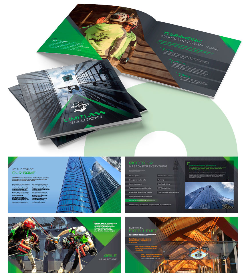
We visually-linked the profile theme by utilising dramatic photography, strong directional design devices and angles using a high-contrast colour palette. Our design absolutely represented Apex’s brand personality – innovative, daring and proactive!

After nailing the design brief, it was time to incorporate the interactive element which would provide readers with multiple ‘small bites’ of information. This feature also enabled us to effectively manage a large amount of content while keeping the PDF file size relatively small and suitable for emailing.

Apex pride themselves as innovation specialists, so we were especially keen to use interactive features to showcase their approach, and to engage and impress potential clients.

The sky’s the limit

Our client soars at heights we can only dream about! Telling their story from a photographic perspective was a powerful tool and certainly provided the hero element in our design.

We shared with the Apex team the value of strong photography and why investing in taking photos of the highest quality from the get-go truly makes an impactful difference to the finished result. From our insights, our client was able to provide us with such an amazing, quality library of images that we were spoilt for choice!

We are using our phone cameras more often to capture candid moments, then quickly posting these to social platforms. Although technology has come a long way, it’s important to recognise that these images are not always suitable for the variety of mediums and materials we design. For example, while a photo may be fine for your brochure, it’s too small to scale-up to suit a wall mural.

Reflecting on a job well done

At the completion of a project, there’s an amazing feeling of satisfaction we get when we’ve achieved a result that we’re proud of – brilliant design with strong brand messaging. This project was a great example of delivering the total package. And the best reward – our client was even happier with the result!

salt-shaker-signoffBecause everything is better with a sprinkle of salt!
SALT.Shaker
 

The power of playful design

As a graphic design studio with a predominantly corporate focus, it’s such fun when we can ‘spread our wings’ on a project like this one! Many Salt projects are guided by brand guidelines where consistency and polished design are required. So what happens when we have a project that calls for fun, playful design without the usual confines of corporate design? We kick-off our shoes and grab our most colourful markers!

Where to begin?

Sometimes, it’s difficult for our clients to know how to begin a new project. So to help with the process, we ask questions to develop the project’s intent and design direction.

The first questions focus on the purpose of the project:

  • What is the reason for this project?
  • Who is the audience?
  • What is the best way to connect with this audience?

And then there’s the technical questions:

  • How many pages?
  • How long will it take?
  • How much will it cost?

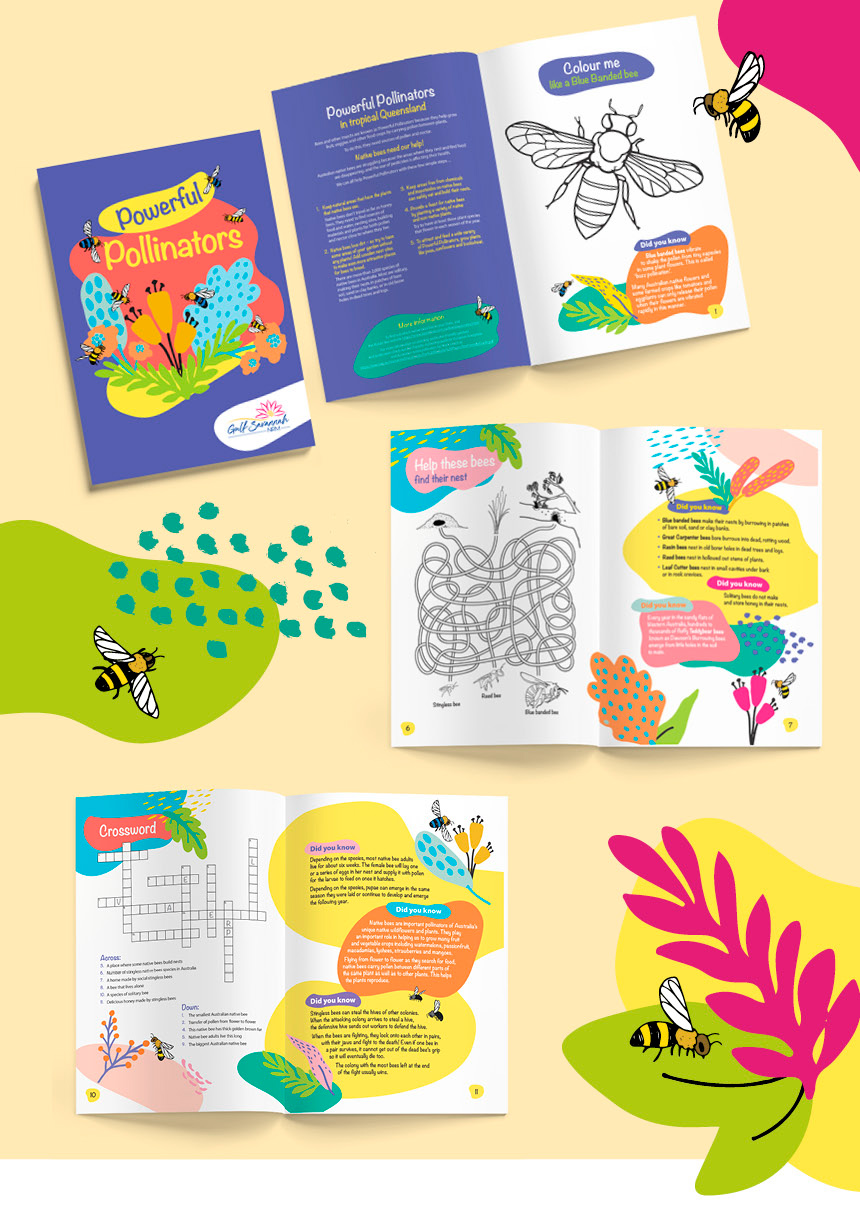
For a new educational resource about Native Australian Bees titled “Powerful Pollinators”, our client had so much knowledge and information to share with school-aged children. They wanted to educate and inspire the generation of future farmers; to show them how important these tiny creatures are to our native habitat and to the future of our environment. By focussing on determining the answers to our questions we were able to understand and develop a strong creative brief for the activity book.

Colour your world!

We wanted to get these avid readers excited about the pages of this activity book. To grab their favourite markers and get to work adding even more colour! Bringing the pages to life with vibrant patterns and graphics, we created a design that catches their attention, encourages them think, learn and have fun!

Understanding what it is we are designing

We read what we design. It’s imperative to ensuring the design befits the content – what is seen first, what comes next, what are the important take-aways from each page. Once we understand the content and context, we use our design expertise to add value and support what is being presented, so it can be easily read and effectively understood.

For Powerful Pollinators, our client provided us with a collection of information snippets and facts, plus a few ideas for activities suitable for the reader’s age group. It was quite a mixed bag!

To begin, we spread the activities across the 12 text pages and then added the relevant fact snippets. Once we had the content in place, we embellished the page designs with heading styles, highlight treatments for facts, and coloured patterns to add life and interest. By considering the page layouts, font styling and colour palette, we brought together the pages to create a playful, yet consistent design. We also remained mindful of the comprehension ability of the reader age group – ensuring font sizes were appropriate and the level of information suitable.

We’re buzzing with excitement to know this activity book has kids having fun while learning!

Thanks also to Ellie and Frankie who tested the activities!

salt-shaker-signoffBecause everything is better with a sprinkle of salt!
SALT.Shaker


Designing delicious websites

There’s a saying “we eat with our eyes!”… So, when your business is food, your website has to be a mouth-watering visual delight!

An unexpected change to doing business

When COVID-19 hit, bookings erased from our event calendars literally overnight! Anniversary celebrations, 21st birthday parties, weddings, corporate engagements, formal dinners were no longer allowed.

Food FX Catering’s business landscape changed significantly due to the pandemic – business lunches were no longer a thing, formal gatherings were reduced to six close contacts, large parties were considered potential health risks.

When word-of-mouth is the modus operandi for new business generation, how do you source new work and new clients?

As a small boutique business, working both in and on the business can be challenging. For Food FX Catering, there never seemed to be enough time to do it all. Sadly, their existing website reflected this – outdated, lacking information and presence.

The silver lining to catering cancellations meant there was time to address the website and ‘pivot’ the business to capture clients online.

Giving customers what they are searching for

People are known to ‘shop around’ for caterers, and websites provide a great starting point to learn the basics – what services are available? and for how much?

Visiting competitor sites provided us an insight into what information to include on the site. Assessing the various methods of promotion cemented the style and design approach we wanted to take. Our client was insistent that they did not want to look too expensive or out-of reach of many. Importantly, they wanted their website to reflect their experience and friendly, wholesome approach to catering.

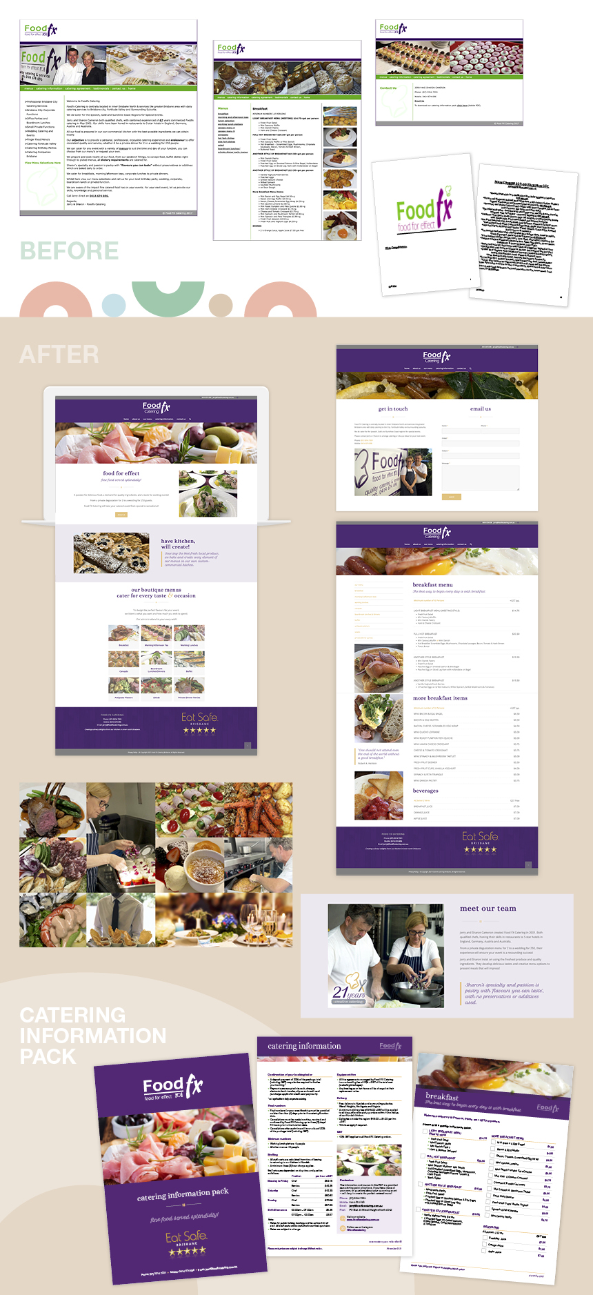
We set about developing a website framework with a better platform for engagement with customers. We created a design layout which visually presents a showcase of our client’s menu and catering capabilities. And we composed content to provide people with the information they search for when choosing a caterer.

“Happiness is eating dessert before lunch!”

As a person-to-person business engagement, it was important to our client that the warm and friendly personality of Food FX Catering was conveyed throughout the site. To do this we used language with a hint of humour – a genuine reflection of our client and their approach.

Although we couldn’t alter the existing logo, we revitalised the brand through colour and typography. And including a tantalisingly tasty selection of images added an emotional response while still provided even more details of the catering services provided.

Catering information pack

So how do you convert a potential customer into an actual booking? Food FX Catering had a Word file which could be downloaded from their site, filled out and submitted for a quote. It was outdated, lacked so much information and missed the opportunity to connect and gather contact information from prospective customers.

We replaced this file with an interactive PDF information kit. The new file provides detailed menus and package options, answers common questions around hiring a caterer, and is easier to submit. The new information kit also saves time for our client to collect booking details, customer information, and gives them a bridge to an initial consultation.

The pandemic was not an experience we want anyone to go through again! However, it has given some businesses the opportunity to reflect, address and reinvigorate their brand and approach to doing business.

As we head toward ‘normal’ life again, we’re glad to see catering events are happening even bigger and better for Food FX Catering! We may be bias, but we think it’s thanks to their website being ‘well-seasoned with Salt!’

salt-shaker-signoffBecause everything is better with a sprinkle of salt!
SALT.Shaker
Promoting the business of Tourism

The world’s eyes are upon us!

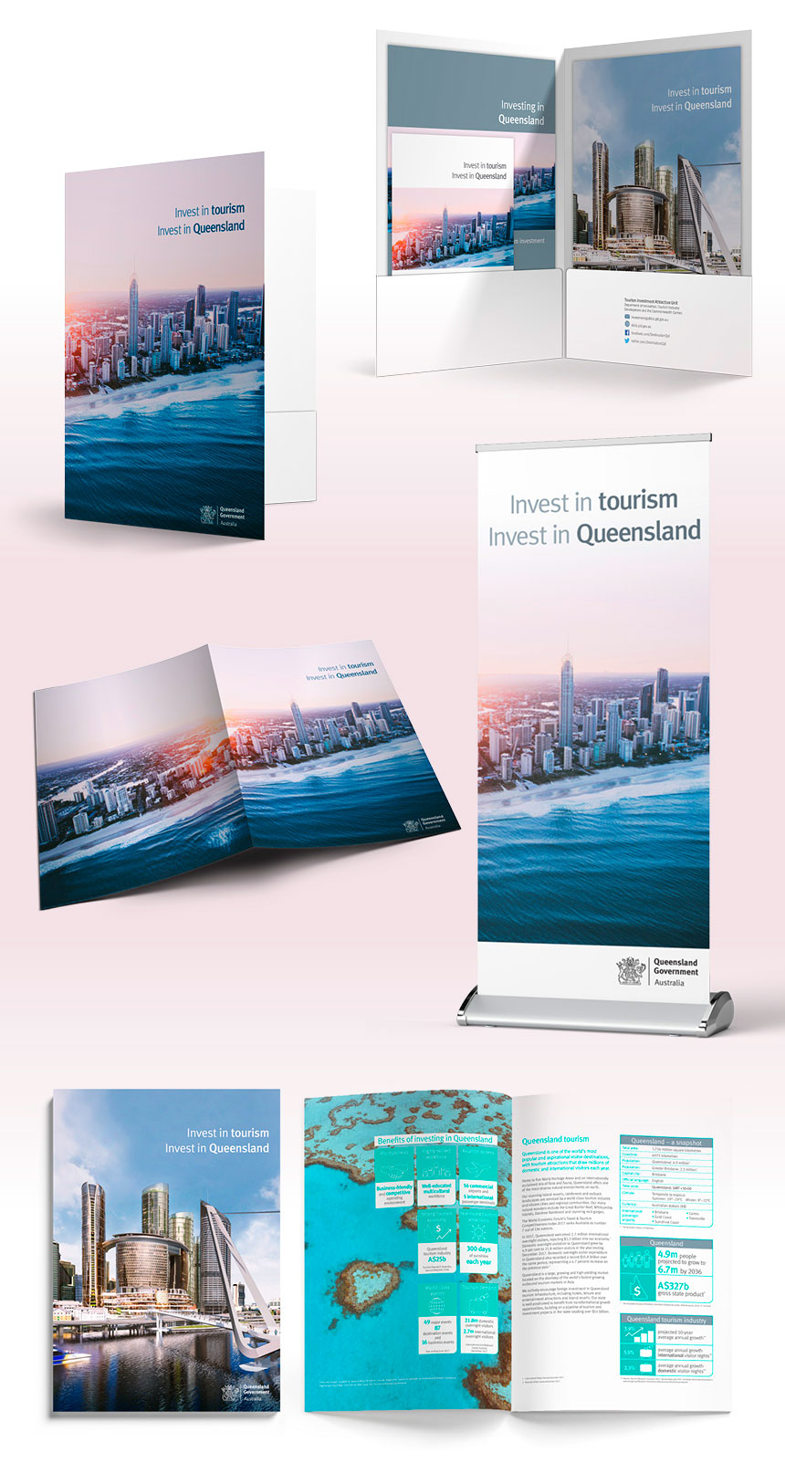
With the world’s eyes focussed on the Gold Coast and Queensland, the 2018 Commonwealth Games provided an amazing opportunity for the State Government to promote investment in tourism developments across our fabulous State!

Initially, we were asked to design and produce digital artwork for a pocketed folder, 48-page prospectus and 4-page brochure. However, soon after we received the design brief, we were asked to also develop even more resources that were required for a Business Breakfast event.

Nothing like a deadline!

The workload was fast increasing in a VERY big way – with the deadline remaining unchanged!

Our ability to design and also PRINT all of the required collateral provided the solution to meeting the deadline.

Our Production Manager co-ordinated the printing of the folders externally, while digitally printing the prospectus, brochures, name badges, programs and display banners in-house. We delivered everything on time!

Déjà vu

Over the past 17 years, Salt Design’s had a huge chunk of experience working with government organisations. Projects have included developing branding for new agencies and entities; designing multiple Annual Reports, Strategic Plans, Consultation Reports and Action Plans; to creating collateral for numerous events, business breakfasts, launches, conferences and announcements!

Knowing how government approval processes work, understanding the many iterations, opinions, edits and amendments that are required is a highly attuned skill we have developed! This project was like so many others – requiring multiple levels of contribution and direction.

To ensure everyone was continually kept abreast of progress, we provided regular, well-documented updates to our client team. Our team collaborated with our client, providing advice, suggestions and solutions to every new idea, query and challenge as it was presented. Working in a pressure-cooker environment is not ideal – but when it’s on, we really love the energy and our team excels with creativity when supported by amazing clients!

Project highlights

Meeting the deadline certainly was a great achievement. However, there were many more highlights and wins…

  • Coordinating the initial design brief with the project team
  • Designing and presenting concept designs for multiple components
  • Provided design direction to the client’s event management team
  • Ensuring all designs adhered to brand guidelines, using specified fonts, colours and brand assets
  • Liaising with representatives from multiple departmental and private sector organisations to obtain logos, images and content
  • Collaborated with our client to determine cost-effective, timely and quality solutions
  • Discussing project requirements, establishing milestones and defining procedures for monitoring production
  • Developing multiple drafts, making client-requested edits over the phone, by email or in person
  • Making ourselves available to make urgent edits and deliver required files after hours and over weekends
  • Selecting suitable images, and ensuring all images would work effectively across all applications (print and digital)
  • Initiated regular production meetings with our client over the full life of the project and provided (by email) regular, detailed progress reports which enabled our team to highlight milestones and requirements for our client’s input
  • Held daily internal production meetings to manage timeframes and identify any issues, to ensure smooth production progress and that all deadlines were met

Managing print production and recommending suitable print techniques, organising external print quotations, negotiating timeframes with suppliers, and monitoring progress throughout production.

Gold! Gold! Gold! Reaching the finish line

We made it! It felt soooo rewarding as we busily packed vehicles with all the printed creative goodness ready to head down to the GC on Easter Sunday!

If you were to ask us what was the best achievement in this project – hands down it would be the amazing collaborative process we had with our clients! From start to finish, they trusted us to deliver!

Together, we exceeded expectations by creating a stunning suite of print collateral which promoted Queensland as a winning destination for tourism!

salt-shaker-signoffBecause everything is better with a sprinkle of salt!
SALT.Shaker
 

ClinRad Logo and Brand Identity

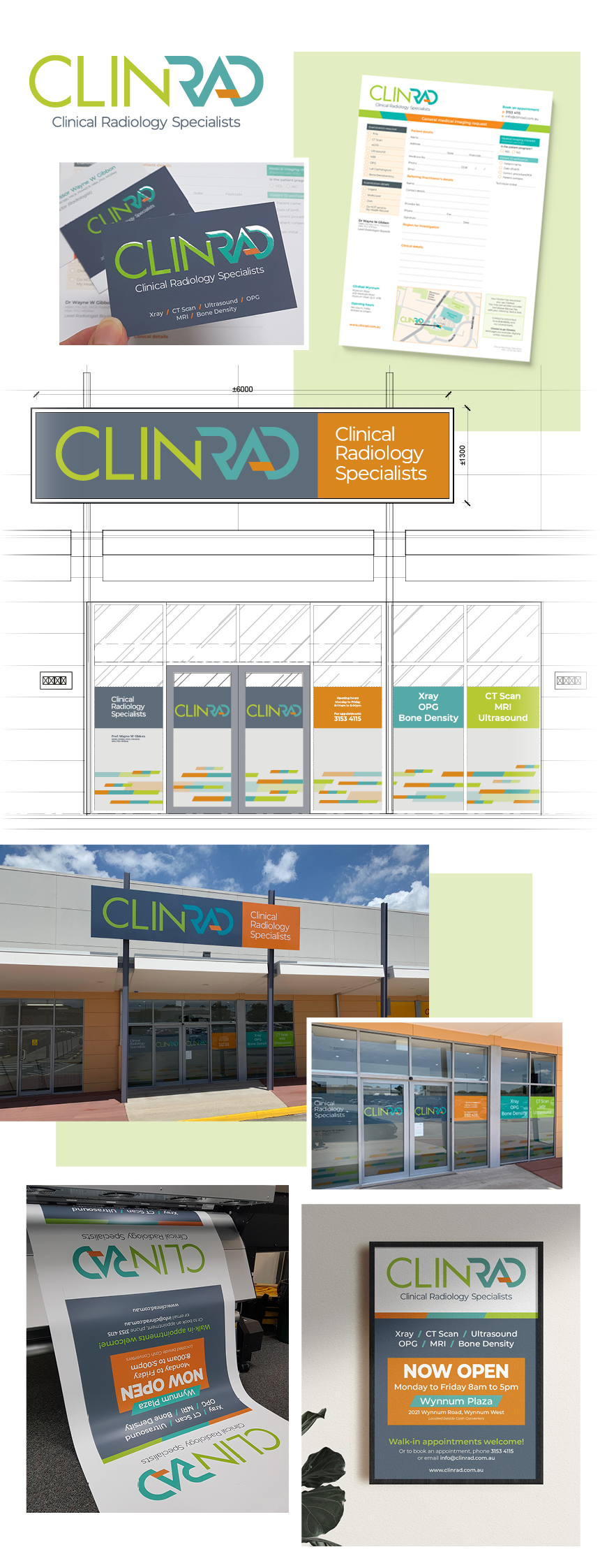
Salt Design was recently approached by Clinical Radiology Specialists to develop their branding identity.

Our new client came to us with relatively no creative brief and a minimal idea of what they wanted . . . EXCEPT for the very definite request NOT to use blue or purple.

This was a totally new business venture in an already saturated local marketplace. Immediately we knew this would be a challenging creative brief – to design a brand which would stand out in the crowd!

Part of our brand development process is to research our client’s market space, investigating the branding and visual profiles of their competitors, local influencers and key stakeholders. It very quickly became apparent just why our client was particularly against the use of this colour palette . . . sooooo many competing brands featured blue or purple as their defining colour. And this was not just a stereotypical feature with the radiology industry, but across multiple medical-related industries!

Blue for you

From the perspective of communicating emotion through colour, using blue for the medical/health space is to some degree understandable as it conveys honesty, reliability and strength – all qualities we look for in our healthcare professionals. However, when an entire industry bases their brand on the same colour palette, it leaves limited capability to visually separate your brand from that of your competitors.

So – how do we create the visual brand for a totally new industry player that ensures they stand out from the crowd in such a homogeneous market?

Such a terrific creative challenge!

What’s in a name?

Our design development started with the Practice name – “Clinical Radiology Specialists”. While a good description of what the Practice did, it possessed little personality and no recall ability. What we needed was a name which was unique and stuck in people’s minds. A name which could provide a strong visual graphic mark (not a typographic essay!).

We created a unique new word by blending the first two words . . . ClinRad.

This single ‘word’ then lead us to the development of the typographic mark for the brand.

Breaking the mould

With blue and purple off the table, we had to find alternative colour combinations that tell the right brand story.

After detailed experimentation, we chose lime green, aqua and orange. Lime green conveys good health and positivity; aqua holds similar calming attributes as blue; and orange provides a striking discord. The combination of these colours embodies a modern and energetic brand palette. And most certainly breaks the mould from medical industry blues!

Creating a typestyle

Early in the design development process, we decide to retain the full business name “Clinical Radiology Specialists” as a supporting byline. This ensured clarity of the function of the Practice. Not only would the brand provide a ‘cool’ new word, it also instantly presents the explanation of what “ClinRad” does… Simples!

In keeping with the ‘hip’ name and edgy colour palette, we initially trialled typefaces that were a noticeable shift from the stereotypical norm used by their competitors.We developed two san-serif typestyles to distinguish the separate parts of the name. We referenced existing typefaces, then manipulated, styled and refined them to create a unique typographic mark with sharp angles and clean edges.

Working through case variations gave us a multitude of design solutions. However we wanted the typography to present how the name would be phonetically read (ie. how the name would be spoken when seeing the logo). By ensuring sufficient contrast in both typestyle and colour between the two word parts, we provided a visual guide as to how the name is pronounced.

Standing out in a crowd

Through considered choices and by pushing beyond the boundaries of what is the expected norm within the industry, we have created a truly unique brand identity for ClinRad.

salt-shaker-signoffBecause everything is better with a sprinkle of salt!
SALT.Shaker
 

Additional to brand development, we designed and produced start-up collateral, business cards, appointment cards, referral pads, shop front signage and poster advertising.

ClinRad Logo design and Brand identity


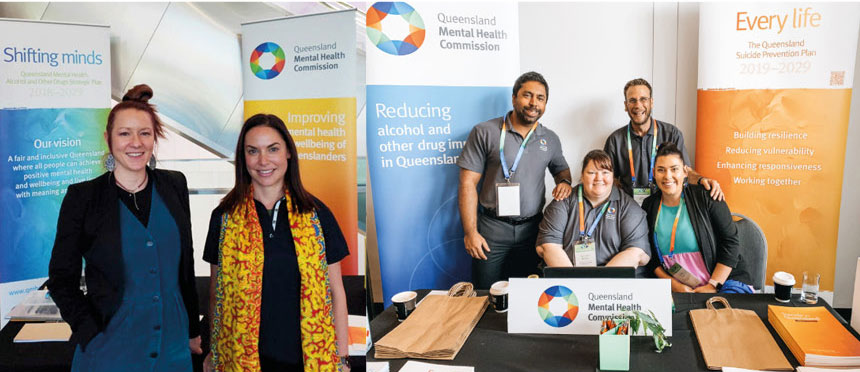
QMHC strategic documents & branding

The importance of a consistent visual brand across a document suite

QMHC is an organisation which drives reform of the mental health and alcohol and other drugs systems in Queensland. Its role is to encourage and facilitate change to improve the mental health and well-being of all Queenslanders.

Salt Design has developed a strong visual profile for QMHC across multiple platforms and projects.

Understanding QMHC’s vision and purpose has enabled us to design engaging, positive, on-message collateral. By ‘getting’ what our client does, understanding their strategies and reason for being, and knowing their audiences, we have such a strong foundation on which to create purposeful designs.

It’s a point we have always felt so strongly about – that we MUST know our clients to be able to successfully create their brand and effectively profile their business purpose. Our work must never reflect our design styles. Rather, it should always communicate who our client is and visually present their business personality.

Art illustrating life

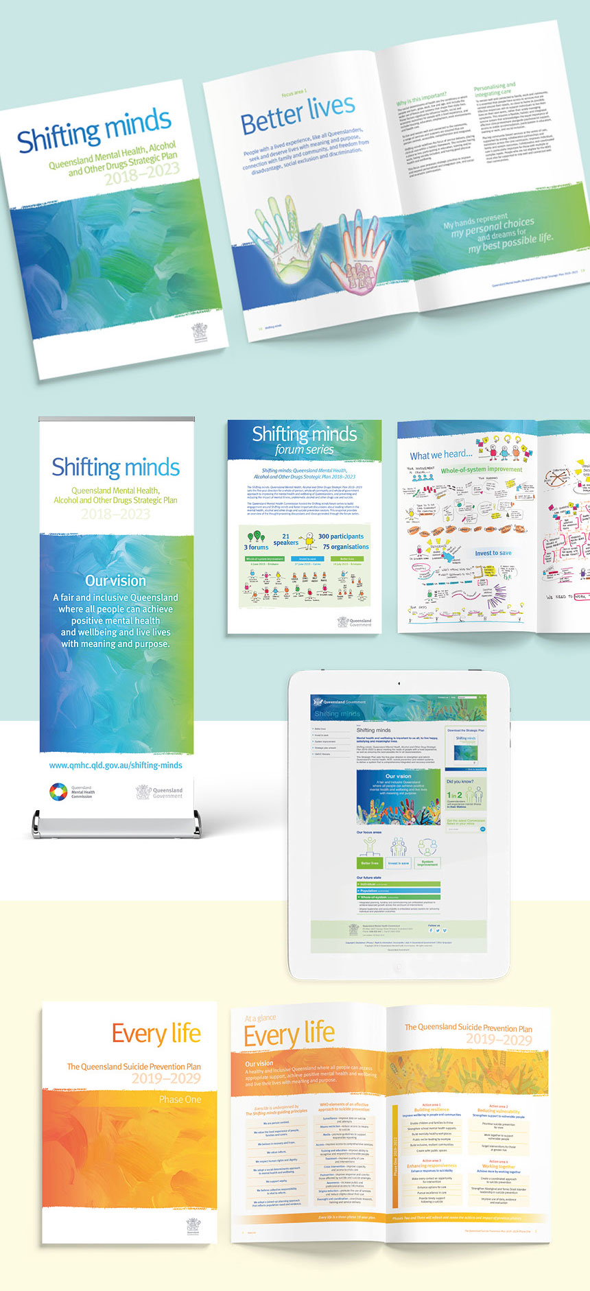
When developing a collection of strategic documents for QMHC, we needed to create a visual brand which represented the organisation’s future plans. A brand which engaged with key industry stakeholders, government, support organisations and the general public. Most importantly, a visual brand which reflected positively the sensitive topic of mental health and wellbeing.

During the initial design briefing, QMHC provided us with a collection of artworks produced during art therapy workshops. The works were powerful portrayals of the very personal journeys of a group of people with lived experience of mental health issues.
Each artwork was a colourful, abstract, multimedia expression, as diverse as the individuals who created them. And they provided the key to the design solution we were after!

Consistent visual branding

We still needed a means by which to ‘connect’ the artworks together within the initial document design. To do this, we selected an abstract painted background graphic. When combined with the artworks, this graphic provided colour, texture and visual interest.

The application of the painterly effect has been diverse. We have applied the graphic to multiple reports and supporting documents, posters, display banners, invitations, social media graphics and online resources.

We have also applied different brand colours to the graphic. By retaining the graphic and changing its colour gradients, we have created a new, fresh brand identity for the latest suite of corporate documents. It has provided a strong visual unity to the resources to make them truly a cohesive collection of information.

salt-shaker-signoffBecause everything is better with a sprinkle of salt!
SALT.Shaker


Femeconomy eBook design and social media graphics

Working with Women for Women

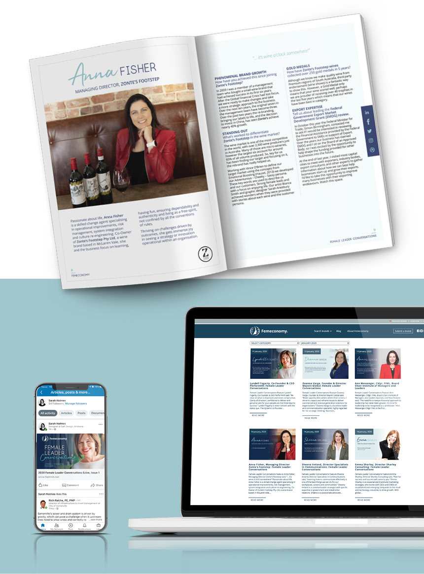
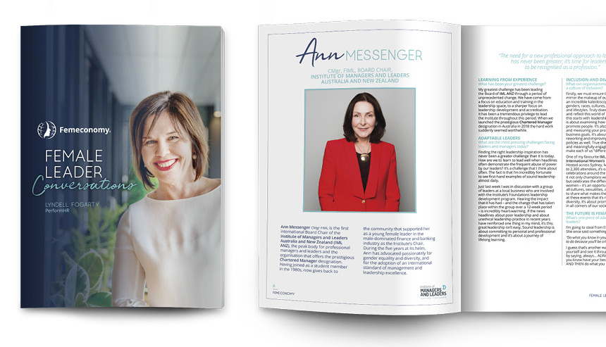
Femeconomy is a membership organisation that fosters gender equality through educating consumers on the power of the purse and the endorsement of female-led brands. Their Female Leader Conversations eBook highlights successful woman and their outstanding results in business.

Salt Design has worked with Femeconomy to design and create two recent editions of these eBooks.

Design considerations

Every project has its own unique range of considerations during our initial design development stage. With the Female Leader Conversations eBook, there were numerous factors that impacted the design and final output. Some factors include technical requirements, whilst other considerations provided us with a strong creative direction…

Colour palette

Our client’s design brief held a very definite stipulation regarding the document colour palette – that pink and purple were not to feature in any way whatsoever! What an awesome challenge – to escape the cliché and develop an aesthetically pleasing, feminine and empowering colour palette!

The 2020 colours, navy and teal, provided such a strong, professional balance being both subtle and the dramatic when applied to our design layout.

Image use

We encountered a technical limitation during the detailed design development process that needed to be resolved. Each featured professional supplied their own photographic digital image… some were landscape format; some portrait; some were close-up headshots; while others location-based. To accommodate each of the varying image formats, we designed multiple page layouts, with different image placement and orientations to ensure the most effective application of the supplied images. Our design solution gave the eBook a ‘magazine-style’ presentation – adding to the appeal and readability of the document.

Design for Social Media

Another factor which we set out to ‘solve’ with our design was that each eBook is distributed via Social Media. This required a design which enabled interactivity and compelled the reader to ‘click’ through to each Leader’s own website and social media channels.

Our client had previously encountered issues promoting the eBook on LinkedIn (their main distribution point). The platform would crop the cover image, cutting off the title and/or the featured Leader’s head. We designed the cover to resolve this issue and ensure all information was confined within the graphic boundaries stipulated for LinkedIn.

To assist in the digital promotion of each e-Book, we also designed digital images for Femeconomy’s blog, email signatures, Facebook and Instagram posts.

Pride in our purpose

Gender equality is a topic that we feel strongly about in our studio. We felt privileged and empowered to contribute to this inspiring and insightful project. Working with an organisation which actively promotes strong women, and female-led brands gave us both purpose and pride in our creative contribution to these impactful documents!

salt-shaker-signoffBecause everything is better with a sprinkle of salt!
SALT.Shaker
 

Femeconomy eBook design and social media assetsFemeconomy eBook design and social media assets

Turning big ideas into winning results // Brisbane State High School

At Salt, we’re known for great design – usually the end product is an A4 Report, brochure, business card, poster or pull-up banner.

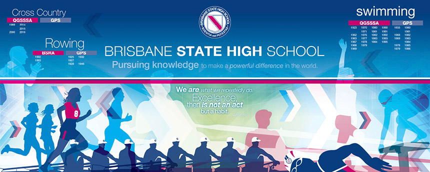
So how excited were we when approached to design, print and install two HUGE murals in one of Brisbane State High School’s (BSHS) Sports Stadiums. What an amazing opportunity to show how design at any scale can inspire, engage and solve even the most challenging of briefs!

Changing a client’s brief

When first contacted, the brief was to design 26 x individual banners to be installed into a VERY large sports arena. However at the site inspection we quickly realised the walls of the stadium were already jammed-packed with ‘visual noise’ – acoustic panelling, basketball hoops, air vents, steel girders, loudspeakers, glass panels. The last thing these walls needed was even more stuff!!!

Instead, we proposed to design and create two eyecatching murals (one for either end of the stadium) which would draw everyone’s focus to the designs.


94 years, 26 sports and 2 corporate colours

The purpose of the banners from the original brief were to display and celebrate the School’s brilliant sporting achievements spanning over 94 years (1922-2016). Each premiership year in each sport (26 sports in total) was to be represented. Just how that could be done in a logical, eye-catching manner was a challenge in design planning.

A future-proofed design

The requirement for the murals is that they can be added to at the end of each year. Sports who have won their annual premiership will have the year added to their sport’s ‘honour roll’. Our design enables white vinyl cut lettering to be applied – with ample space for the School’s anticipated sporting excellence to continue in every sport for many years to come!

No photos please

Due to the potential limitations of using actual photographs within the design, our client requested that we find an alternative means by which to represent each sport. Planning for the longevity of the artworks (envisaging issues such as changes to uniforms, student privacy and potential copyright ownership of photographic images) lead us to opting for developing silhouette illustrations for each sport – some of which we added the School’s actual sporting uniform to provide even stronger visual links to BSHS.

“We are what we repeatedly do. Excellence, then, is not an act but a habit.” – Aristotle

Our design was based on a ‘layered’ image approach using the School’s corporate colour palette. Having already worked with the school, we understood their strong drive to encourange and empower students. So we added another ‘layer’ to the design by including motivational quotes which adds a sense of celebration of achievements and recognition that it is not about winning – but doing your best.

Getting the job done before the school bell

Timing for the production and installation of the murals was critical – the murals needed to be installed before the first day of school! We received final artwork approval two days before Christmas! Printing and planning for the installation took place during the first and second weeks of January.

Installation took a VERY long day. Planning was crucial as it involved hiring a specialised crane/lift which weighed less than the restricted requirements for the timber flooring in the stadium. Watch our video below to see how the day went…

The siren may have sounded – but the games have only just begun!

We are so pleased with the result! And even better is that our client is too! There is now a strong point of visual focus within the stadium – which reinforces the School’s visual brand and it’s vision for the School, its students and the entire school community.

Perhaps, as the clock counts down the last seconds of the next nail-biting game – it provides some winning motivation!

salt-shaker-signoffBecause everything is better with a sprinkle of salt!
SALT.Shaker


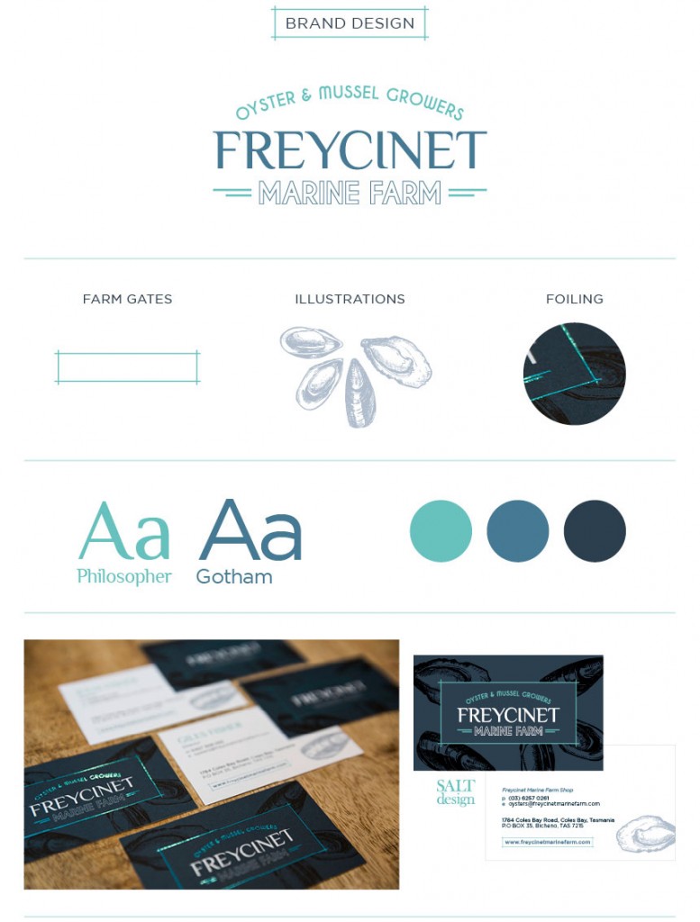
When the world is your oyster – you need to look as good as you taste!

We eat with our eyes, so it made perfect sense for our client Freycinet Marine Farm to approach Salt Design to refresh their corporate identity. You can view our initial re-brand project here!

Wide format print production

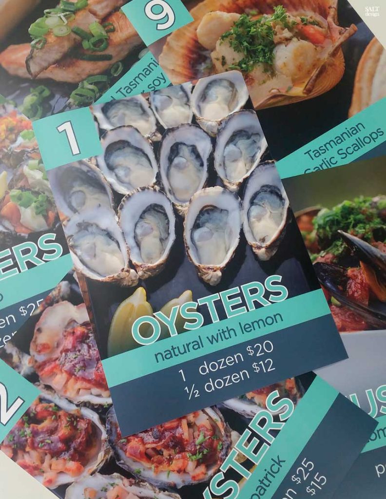
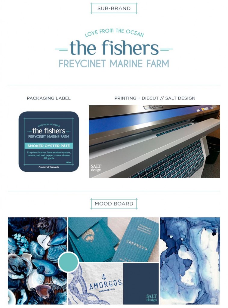
Once again, Salt Design’s wide format print capabilities have proven so valuable to our designs! We have recently printed a suite of menu signs for the counter display! We are so pleased to have replaced the old make-shift signs with these delicious-looking posters!

Printed on our Roland XR-640 Wide Format Printer, using BJBALL Rhino W/F PP White Film Solvent SB300 ensuring the menus are easily cleaned and will continue to look like new!

Recent accolades

Recently, Freycinet Marine Farm came second in the Tasmanian Tourism Awards. Recognised nationally and internationally, this prestigious Award is proof of our client’s quality products, business acumen and progressive approach to tourism.

Congratulations Julia, Giles and all the Freycinet Marine Farm Team!

Next challenge

We have loved our involvement with Freycinet Marine Farm so far! We hope to begin designing a new website for them in the new year. . .

salt-shaker-signoffBecause everything is better with a sprinkle of salt!
SALT.Shaker


LIA – 50 years young!

Salt was recently approached to update the branding for LIA Queensland. LIA (the Lithographic Institute of Australia) was originally formed over 50 years ago. It is a well-respected industry association providing support, knowledge and connections for all within the printing and graphic arts industry.

Why we should never change for change sake?

For many long-standing members their logo was a ‘sacred cow’ and should NEVER be changed. But to others the organisation was in desperate need of an update – a means by which to engage with a new younger generation. Membership numbers have been waning for a number of years – so a fresh presentation of the organisation’s branding was hoped to be a first positive step toward reviving interest in LIA. But where to begin????

How do you ‘update’ a 50-year-old logo? How do you not offend the traditionalists? How do you attract a new, much younger, more progressive audience?

Our solution . . .

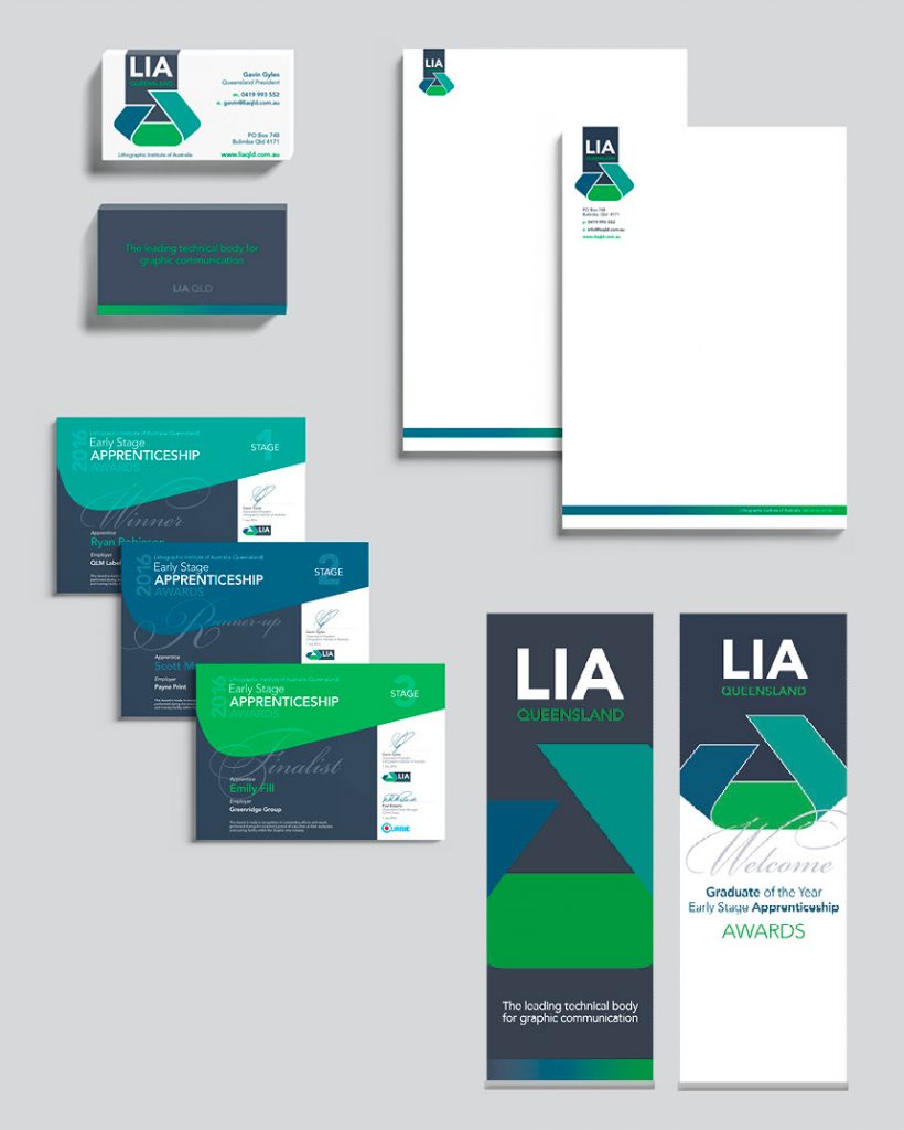
NOT to change the logo. Rather, refine it and add a new dimension to its application. By addressing the dated typography and finessing the existing logo symbol, we were able to reinvigorate the identity. By broadening the colour palette we were able to retain the ‘traditional’ LIA Green whilst enhancing its application by placing the logo on a darker, neutral colour.

The result

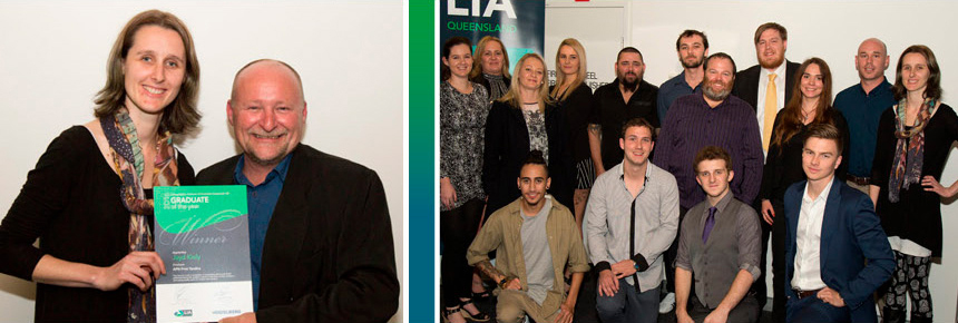
Each year the LIA promotes and presents the Annual “Graduate of the Year” Awards for apprentices within the Queensland Print Industry. The Awards event provided Salt with an opportunity to launch the new branding by applying it to a number of promotional resources including a Display Banner, Table Tent Cards, Award Certificates and PowerPoint presentation.

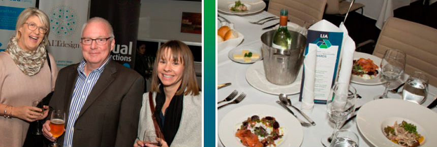
We were invited to attend the Awards event on 7 July. It’s an opportunity we rarely get – but one which we really love! To actually see how attendees reacted to the new branding on the Display Banners and to watch the PowerPoint presentation was terrific! The branding really worked in a consistent contemporary manner. Award recipients were overheard saying that it was the “best-looking Award Certificate they had even seen!”

Kudos to Gemma

The development of the new LIA branding was the work of Salt’s Junior Designer Gemma Jestico. The project provided a valuable learning ground for Gemma, who designed all of the corporate and promotional collateral along with documenting the application in a detailed branding guidelines. Love your work Gemma!

Our next challenge

Our work is not yet complete, as we are now investigating the development and construction of a new website for the LIA.
This will also provide our newer Salt Designers with a fabulous opportunity to learn in more detail the technical requirements of design for web.

salt-shaker-signoffBecause everything is better with a sprinkle of salt!
SALT.Shaker