A brand’s new life
When a small, family-owned regional enterprise first sets out on its pathway to success, the logo is a very personal connection to who they are and what they stand for. It is worn with pride as the business grows. However, sometimes the visual brand is left behind in the process of expansion. Then, almost overnight, it is realised that the brand has become outdated and no longer portrays what the business has become…
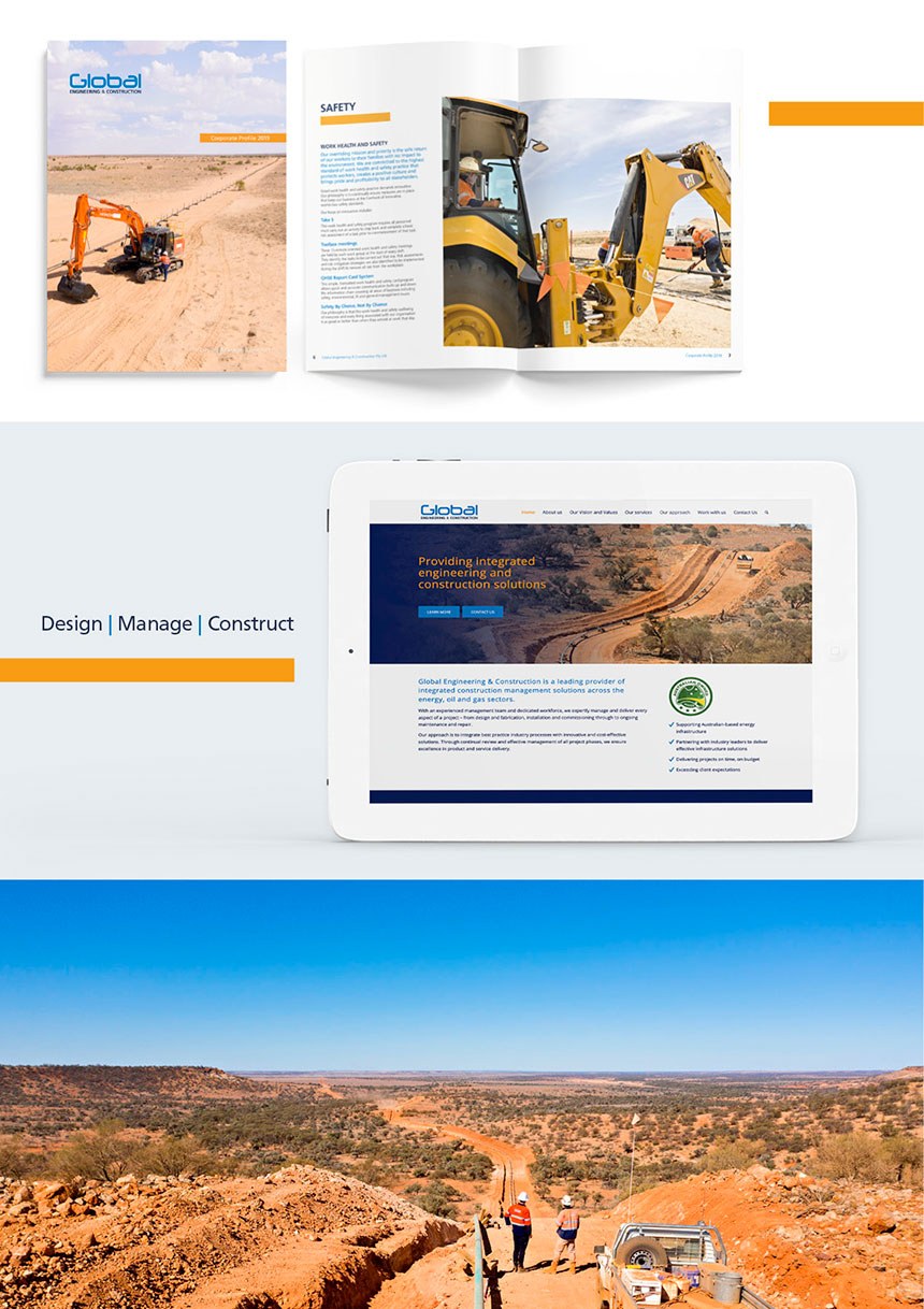
This was the story for Global Engineering & Construction when they first approached us. The logo was still a proud emblem of the business – so we were not to alter it significantly. Our brief was to finesse the logo to create a more contemporary and refined mark and then apply it to new corporate collateral.
By re-imagining the brand’s key elements (logo, font styling, imagery and colour palette) we have achieved a fresh, energised new take of the original identity.
Building a new brand for all
Global started in 2012 with a team of five and has now grown to over 250 staff. Due to the rapid expansion of the business, consistency of identity and application had been left behind.
While there are a multitude of important factors to address in a fast-growing business, maintaining a solid brand identity and culture is vital.
Global understands this and recognises how important it is for staff, partners, suppliers, and existing and potential customers to identify with the business through its visual identity.
Every picture tells a story
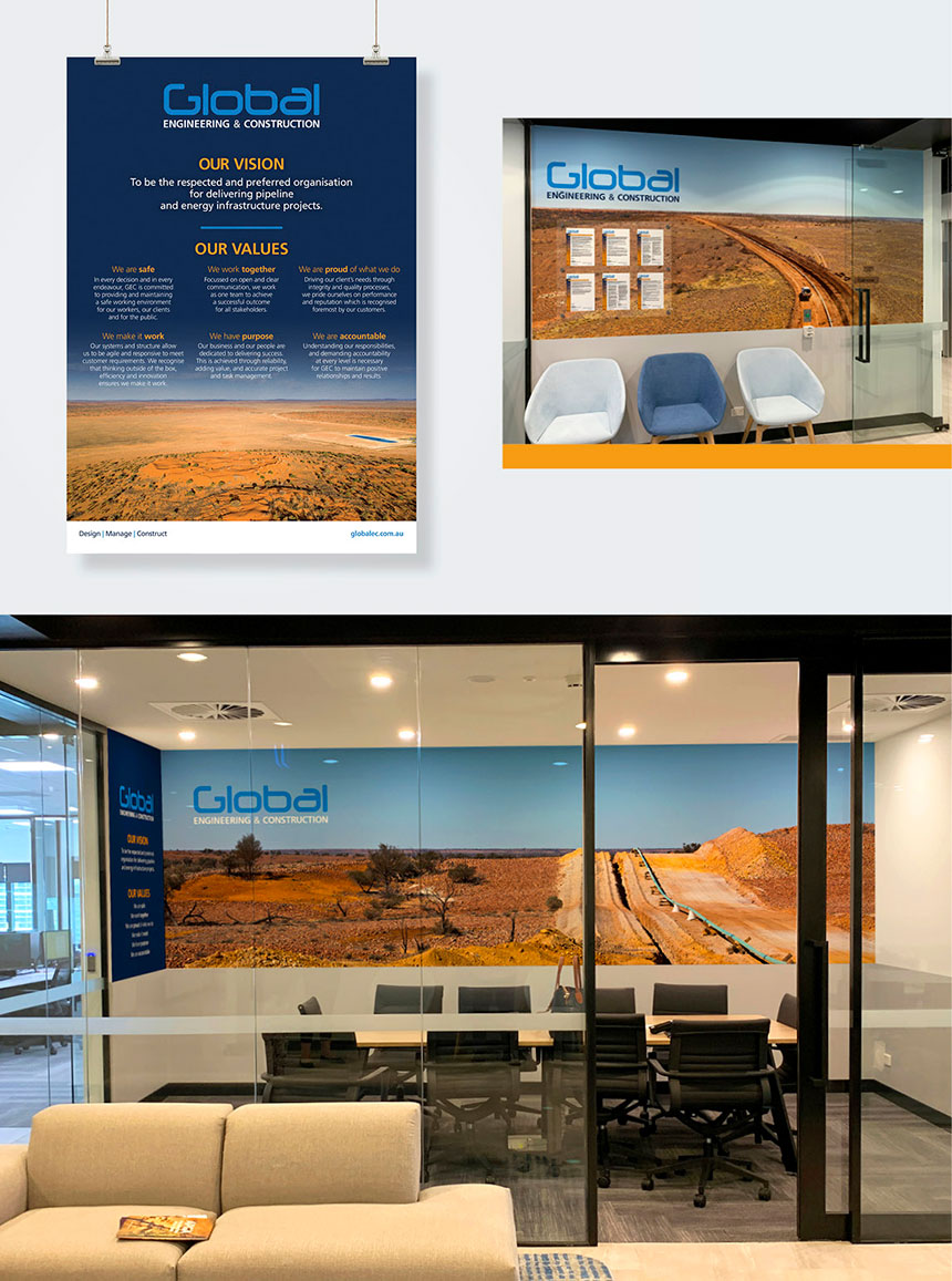
Global operations are predominantly based in regional Queensland and South Australia – Australia’s iconic outback known for rugged, stunning landscapes. We have captured these vast landscapes in a portfolio of photography, which has become the hero element within our designs.
Colour
Taking inspiration from the blue skies and ochre earth, we expanded the brand colour palette. The combination of imagery with the refined colours provides a strong, confident identity.
Developing organisational culture through branding
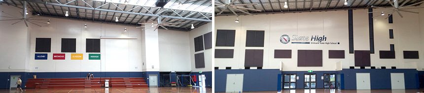
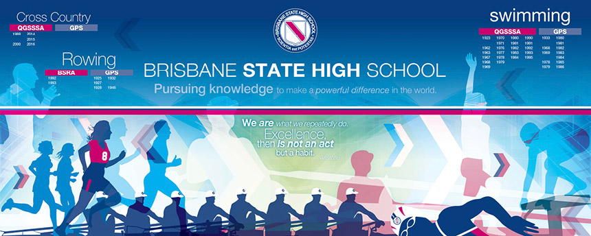
One of our initial projects was to design resources featuring the organisation’s vision and values. Global needed a strong, unifying foundation on which to grow a positive staff culture. Posters, murals, screensavers and corporate documents all present these key messages in a way which expresses pride and teamwork.
Growing the brand
With the ‘new’ logo in place, we have developed a consistent, contemporary application of the brand that expresses the business it is today.
We have produced a wide variety of resources and branded collateral including stationery, corporate profiles, safety documentation, induction presentations, social media promotions and a new website.
We have loved this journey – collaborating with our client to build new resources and enhance the value of their brand through creative design.
![]() Because everything is better with a sprinkle of salt!
Because everything is better with a sprinkle of salt!
SALT.Shaker


