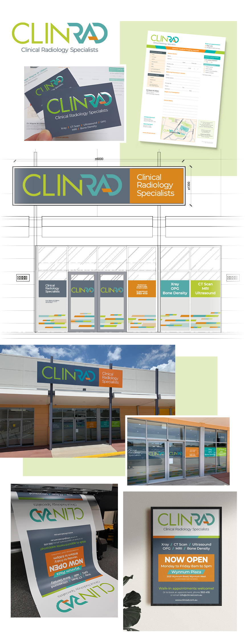
ClinRad Logo and Brand Identity
Salt Design was recently approached by Clinical Radiology Specialists to develop their branding identity.
Our new client came to us with relatively no creative brief and a minimal idea of what they wanted . . . EXCEPT for the very definite request NOT to use blue or purple.
This was a totally new business venture in an already saturated local marketplace. Immediately we knew this would be a challenging creative brief – to design a brand which would stand out in the crowd!
Part of our brand development process is to research our client’s market space, investigating the branding and visual profiles of their competitors, local influencers and key stakeholders. It very quickly became apparent just why our client was particularly against the use of this colour palette . . . sooooo many competing brands featured blue or purple as their defining colour. And this was not just a stereotypical feature with the radiology industry, but across multiple medical-related industries!
Blue for you
From the perspective of communicating emotion through colour, using blue for the medical/health space is to some degree understandable as it conveys honesty, reliability and strength – all qualities we look for in our healthcare professionals. However, when an entire industry bases their brand on the same colour palette, it leaves limited capability to visually separate your brand from that of your competitors.
So – how do we create the visual brand for a totally new industry player that ensures they stand out from the crowd in such a homogeneous market?
Such a terrific creative challenge!
What’s in a name?
Our design development started with the Practice name – “Clinical Radiology Specialists”. While a good description of what the Practice did, it possessed little personality and no recall ability. What we needed was a name which was unique and stuck in people’s minds. A name which could provide a strong visual graphic mark (not a typographic essay!).
We created a unique new word by blending the first two words . . . ClinRad.
This single ‘word’ then lead us to the development of the typographic mark for the brand.
Breaking the mould
With blue and purple off the table, we had to find alternative colour combinations that tell the right brand story.
After detailed experimentation, we chose lime green, aqua and orange. Lime green conveys good health and positivity; aqua holds similar calming attributes as blue; and orange provides a striking discord. The combination of these colours embodies a modern and energetic brand palette. And most certainly breaks the mould from medical industry blues!
Creating a typestyle
Early in the design development process, we decide to retain the full business name “Clinical Radiology Specialists” as a supporting byline. This ensured clarity of the function of the Practice. Not only would the brand provide a ‘cool’ new word, it also instantly presents the explanation of what “ClinRad” does… Simples!
In keeping with the ‘hip’ name and edgy colour palette, we initially trialled typefaces that were a noticeable shift from the stereotypical norm used by their competitors.We developed two san-serif typestyles to distinguish the separate parts of the name. We referenced existing typefaces, then manipulated, styled and refined them to create a unique typographic mark with sharp angles and clean edges.
Working through case variations gave us a multitude of design solutions. However we wanted the typography to present how the name would be phonetically read (ie. how the name would be spoken when seeing the logo). By ensuring sufficient contrast in both typestyle and colour between the two word parts, we provided a visual guide as to how the name is pronounced.
Standing out in a crowd
Through considered choices and by pushing beyond the boundaries of what is the expected norm within the industry, we have created a truly unique brand identity for ClinRad.
![]() Because everything is better with a sprinkle of salt!
Because everything is better with a sprinkle of salt!
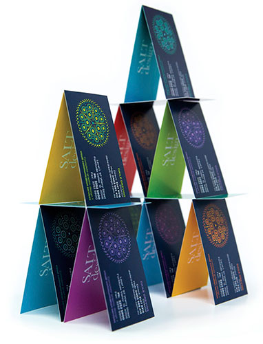
SALT.Shaker
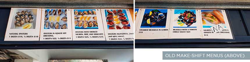
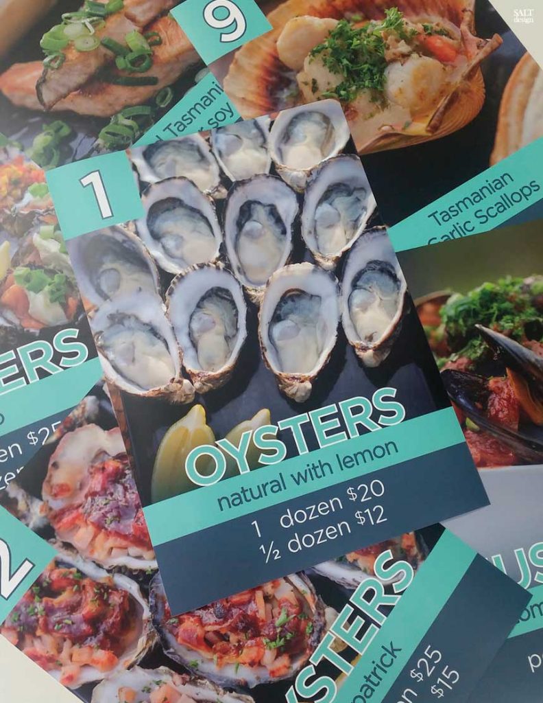
Additional to brand development, we designed and produced start-up collateral, business cards, appointment cards, referral pads, shop front signage and poster advertising.


