QMHC strategic documents & branding
The importance of a consistent visual brand across a document suite
QMHC is an organisation which drives reform of the mental health and alcohol and other drugs systems in Queensland. Its role is to encourage and facilitate change to improve the mental health and well-being of all Queenslanders.
Salt Design has developed a strong visual profile for QMHC across multiple platforms and projects.
Understanding QMHC’s vision and purpose has enabled us to design engaging, positive, on-message collateral. By ‘getting’ what our client does, understanding their strategies and reason for being, and knowing their audiences, we have such a strong foundation on which to create purposeful designs.
It’s a point we have always felt so strongly about – that we MUST know our clients to be able to successfully create their brand and effectively profile their business purpose. Our work must never reflect our design styles. Rather, it should always communicate who our client is and visually present their business personality.
Art illustrating life
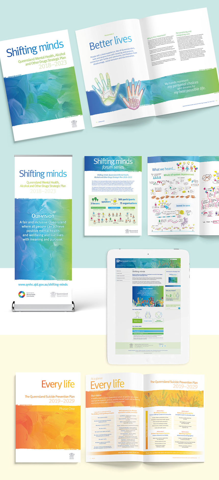
When developing a collection of strategic documents for QMHC, we needed to create a visual brand which represented the organisation’s future plans. A brand which engaged with key industry stakeholders, government, support organisations and the general public. Most importantly, a visual brand which reflected positively the sensitive topic of mental health and wellbeing.
During the initial design briefing, QMHC provided us with a collection of artworks produced during art therapy workshops. The works were powerful portrayals of the very personal journeys of a group of people with lived experience of mental health issues.
Each artwork was a colourful, abstract, multimedia expression, as diverse as the individuals who created them. And they provided the key to the design solution we were after!
Consistent visual branding
We still needed a means by which to ‘connect’ the artworks together within the initial document design. To do this, we selected an abstract painted background graphic. When combined with the artworks, this graphic provided colour, texture and visual interest.
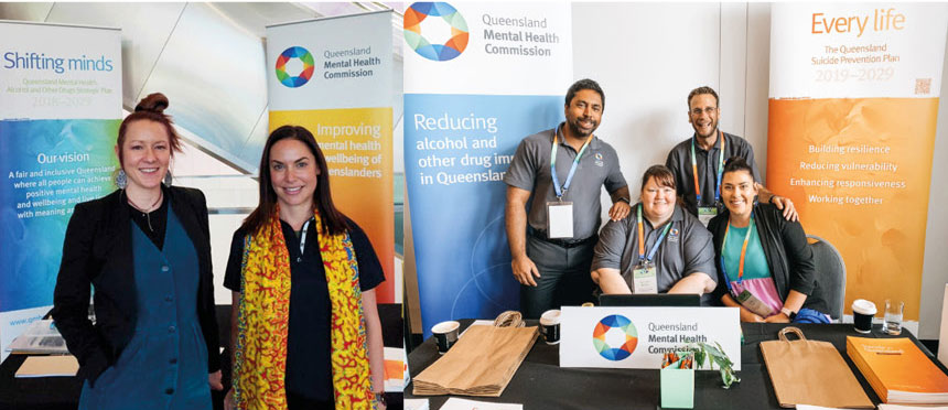
The application of the painterly effect has been diverse. We have applied the graphic to multiple reports and supporting documents, posters, display banners, invitations, social media graphics and online resources.
We have also applied different brand colours to the graphic. By retaining the graphic and changing its colour gradients, we have created a new, fresh brand identity for the latest suite of corporate documents. It has provided a strong visual unity to the resources to make them truly a cohesive collection of information.
![]() Because everything is better with a sprinkle of salt!
Because everything is better with a sprinkle of salt!
SALT.Shaker


